

1.Take a magazine, newspaper or book that includes images and text. Lay tracing paper over the top of three spreads (both left-hand and right-hand pages). Using a pencil and ruler, carefully trace the grid underlying the page layouts. Remember to remove specific text elements or images, and to only draw the grid lines. Note column widths and margin sizes at the top, bottom, and to the left and right of the main body of text. Is your document based on a two-column, three-column, or another type of grid? Which elements stay the same on each page, and which change?
2.Publish your findings to your WordPress blog and provide photos or scans of your exercise.
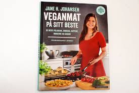
I chose to analyse the layout of the following book:
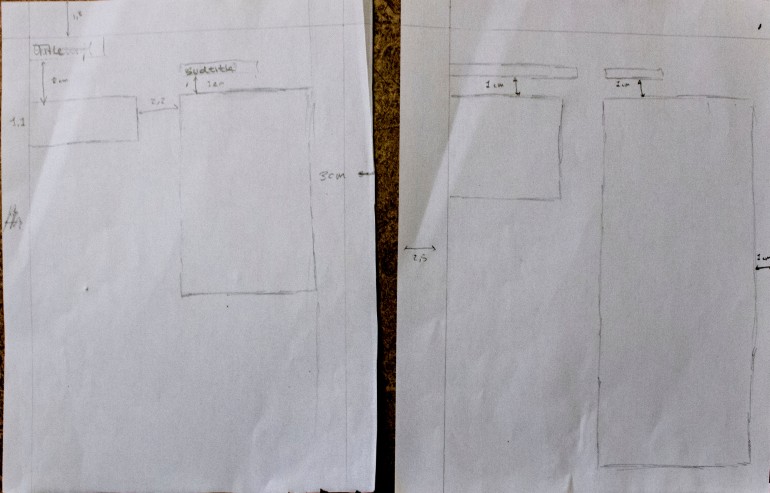
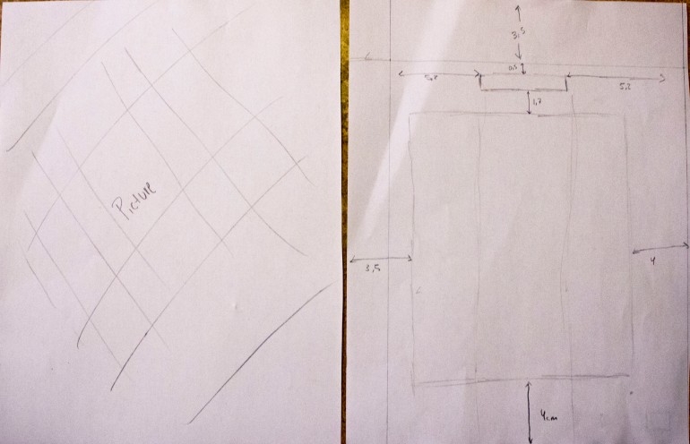
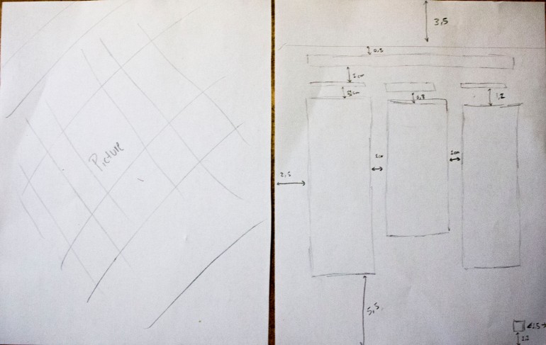
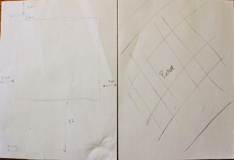
I noticed that in this book the pages are constantly changing at the beginning and then stay the same quite a while. This creates a momentum to push the viewer further into the book. Afterwards the book is really consistent with its use of big pictures that occupy whole pages and the same typography throughout the book. I think a 3 column grid system is what is given them flexibility for creating this layout.
